election_data <- tribble(
                    ~party, ~seats_won,
       "Australian Greens",          3,
  "Australian Labor Party",         55,
                 "Liberal",         21,
           "The Nationals",          6,
        "Other Candidates",          3
)Bar charts (or bar graphs) are commonly used, but they’re also a simple type of graph where the defaults in ggplot leave a lot to be desired. This is a step-by-step description of how I’d go about improving them, describing the thought processess along the way. Every plot is different and the decisions you make need to reflect the message you’re trying to convey, so don’t treat this post as a recipe, treat it as some points to consider—and hopefully, a few tips that will help you achieve the look you want in your own plots.
For this blog post, I’m going to use the number of seats won by each political party in the 2018 Victorian state election as an example. This data was obtained from the Victorian Electoral Commission. Victorians may remember this election being described as a “Danslide”, where Labor, led by Premier Daniel Andrews, won a clear majority of seats.
Here’s the data as an R command you can paste if you want to try making these plots yourself:
The first decision to make when you’re thinking of making a bar chart is whether you’d be better off using a different type of plot entirely. Bar charts are most suitable for displaying counts, percentages or other quantities where zero has a special meaning. If you make a bar chart, your axis should always start at zero, or the area of the bar gives a misleading visual impression. Other ways of representing data, such as box plots or points with error bars, may be more appropriate for quantities where zero is not an important reference point. If you are representing time series data (repeated observations made over time), a continuous line (perhaps with points at the the times where observations were made) is almost always better than a sequence of bars.
The second decision to make is which axis to put the categorical variable and which axis to put the numerical variable. Having the categories on the y axis often works best. It gives you more space when you have either a large number of categories or categories with long labels.
A lot of software either makes it more difficult to put categories on the y axis, or requires you to change a setting away from the default. This used to be the case for ggplot, but as of version 3.3.0, you just need to tell it which variable goes on which axis, and it will figure out the rest:
ggplot(election_data,
       aes(x = seats_won, y = party)) +
  geom_col()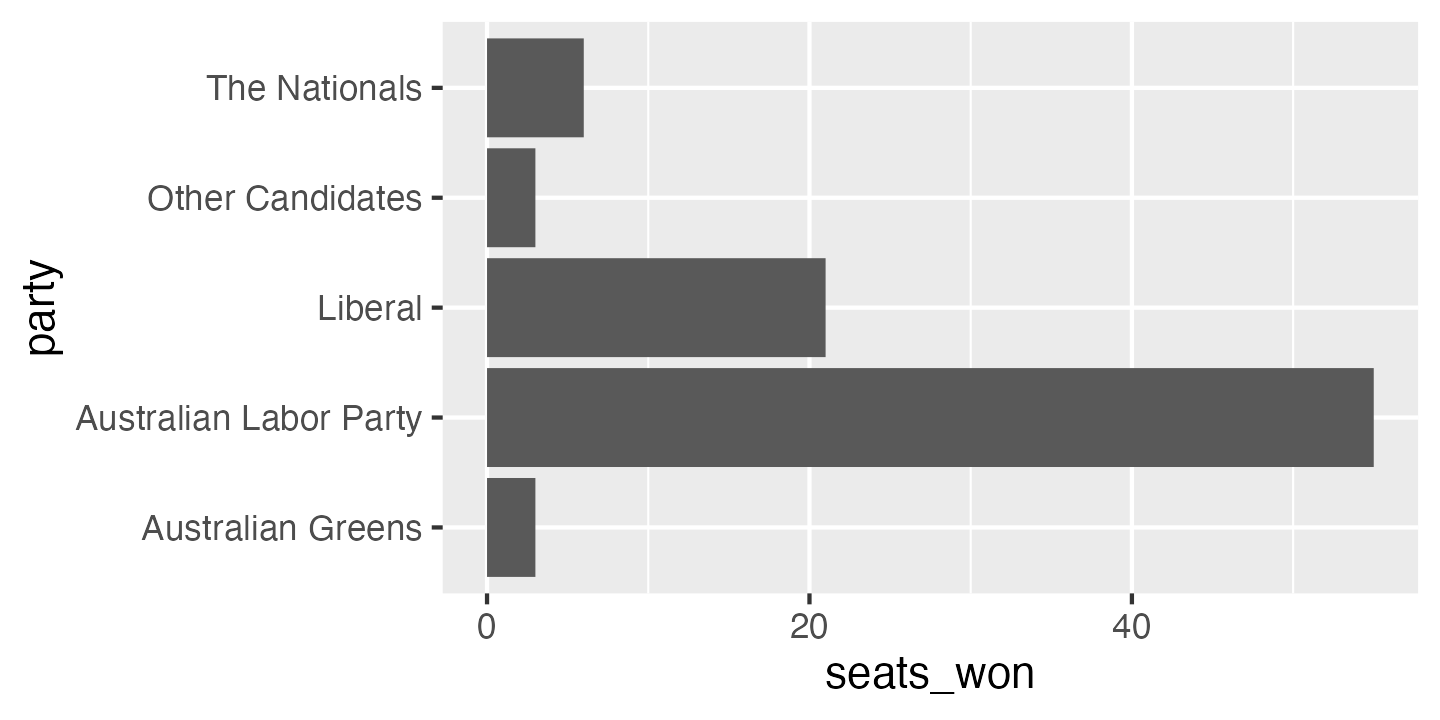
The bar chart above is a good starting point, but quite a few things could be improved. The order of the categories is a bit odd: from top to bottom, it’s in reverse alphabetical order. This is the default in ggplot, but it is almost never what you want. The easiest way to change this is to give the option limits = rev to the y axis scale (this is also new in ggplot version 3.3.0):
ggplot(election_data,
       aes(x = seats_won, y = party)) +
  geom_col() +
  scale_y_discrete(limits = rev)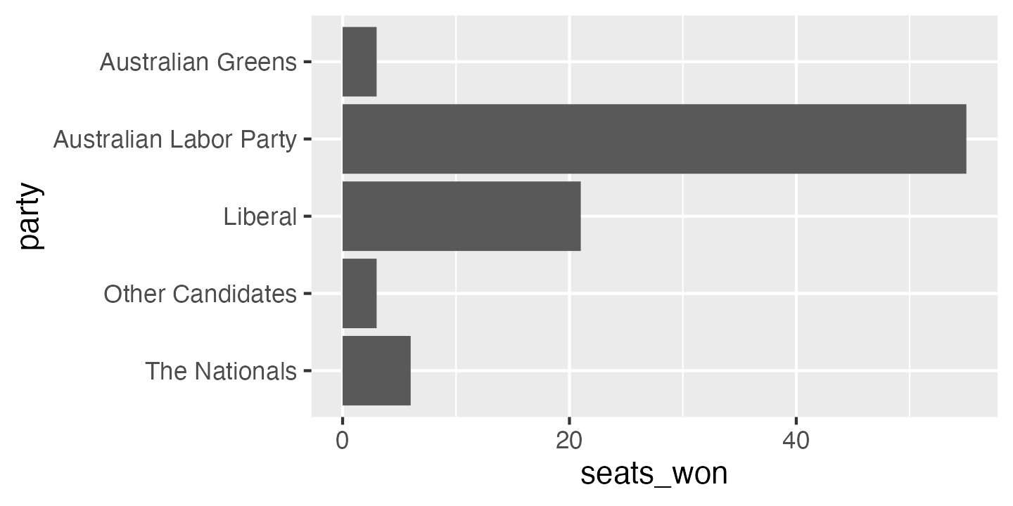
In this particular case, alphabetical ordering isn’t the best choice. It’s often best to order categories from most common to least common, or from most to least in the variable you’re displaying (e.g. most to least seats won). There are two functions in the forcats package which can help with this: fct_infreq orders the level of a factor by how frequently they occur in the data, and fct_reorder orders the level of a factor by the values of a different variable.
election_data_sorted <- election_data %>%
mutate(party = fct_reorder(party, seats_won, .desc = TRUE))ggplot(election_data_sorted,
aes(x = seats_won, y = party)) +
geom_col() +
scale_y_discrete(limits = rev)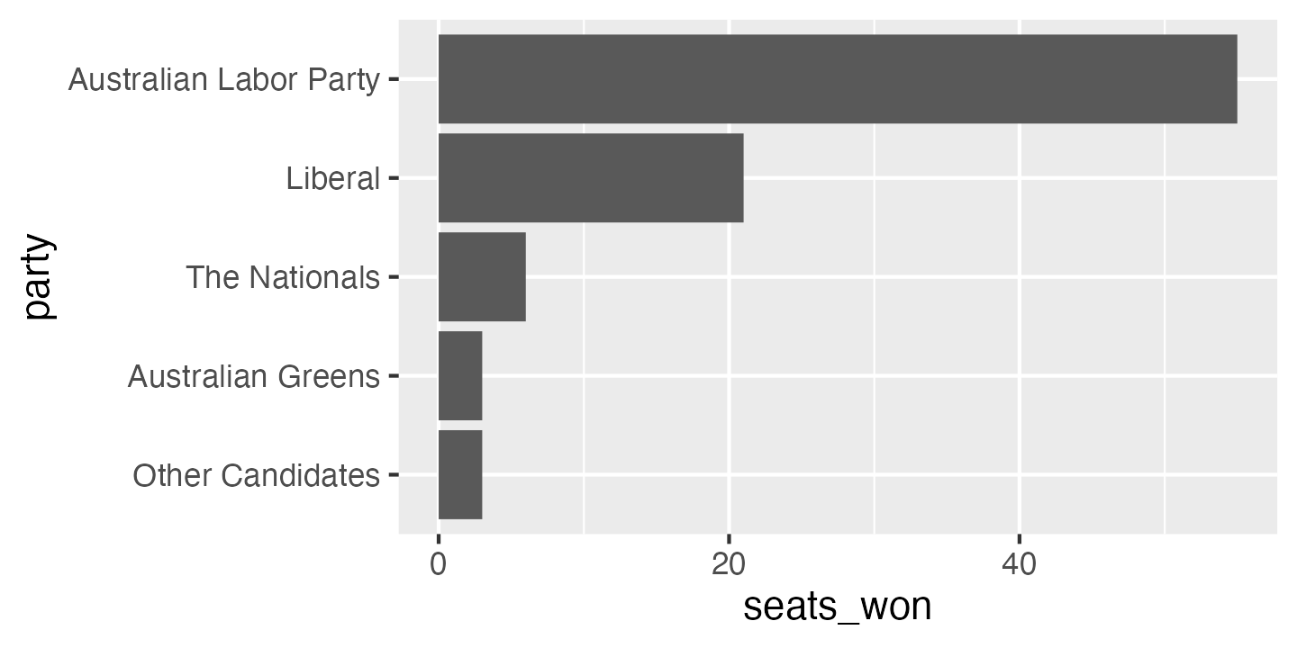
If I was doing exploratory data analysis, or making a quick plot to show a colleague, I might stop at this point. But there is still plenty of room for improvement. To start with, the axis labels are the variable names in our data frame, which is better than no labels at all, but are usually too brief or jargon-laden for a wider audience. A good plot can be interpreted clearly with as little supporting information as possible—remember that a reader’s eye will be drawn to a large, colourful figure and ignore the paragraphs of text you’ve written describing the full context.
I’ve also changed the origin of the x axis so the bars are hard against the axis. Putting a blank space to the left of zero on a bar chart is something I’ve only ever seen in ggplot. It’s caused by ggplot’s standard rule of adding 10% padding on either side of the biggest and smallest values plotted. You can turn it off by setting the expand option on the x axis scale.
ggplot(election_data_sorted,
       aes(x = seats_won, y = party)) +
  geom_col() +
  scale_x_continuous(expand = expansion(mult = c(0, 0.1))) +
  scale_y_discrete(limits = rev) +
  labs(x = "Number of seats won",
       y = "Party")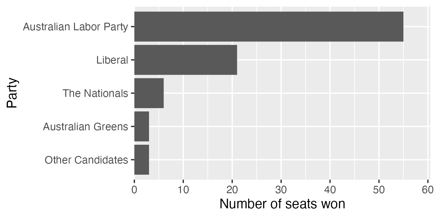
The grey background with white gridlines is a very distinctive ggplot default. Sometimes it works well—it can reduce the visual noise of gridlines in complex plots—but in this case I would normally opt for a simpler. I often use theme_bw or theme_minimal.
ggplot(election_data_sorted,
       aes(x = seats_won, y = party)) +
  geom_col() +
  scale_x_continuous(expand = expansion(mult = c(0, 0.1))) +
  scale_y_discrete(limits = rev) +
  labs(x = "Number of seats won",
       y = "Party") +
  theme_bw()
The gridlines on the x axis are useful guides to the eye, but for a categorical variable with only a few categories, the gridlines only introduce clutter. They can be removed using the theme function.
ggplot(election_data_sorted,
       aes(x = seats_won, y = party)) +
  geom_col() +
  scale_x_continuous(expand = expansion(mult = c(0, 0.1))) +
  scale_y_discrete(limits = rev) +
  labs(x = "Number of seats won",
       y = "Party") +
  theme_bw() +
  theme(panel.grid.major.y = element_blank())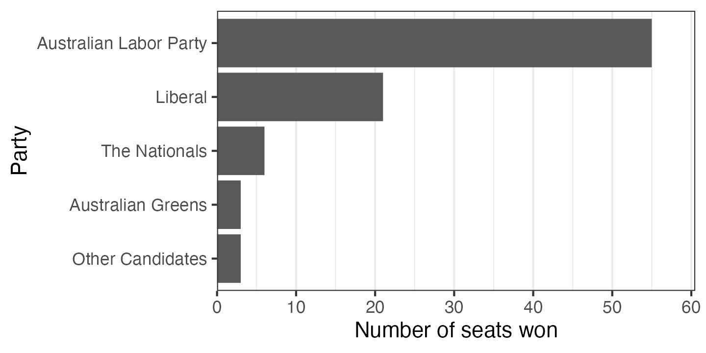
The default dark grey bars look a bit drab. You can choose a colour and give it as an option to geom_col. If you’re like me, you’ll probably try a couple of wrong things first: either passing the colour inside aes() (won’t work, because the colour will be interpreted as data to plot) or using colour instead of fill (which changes the border colour instead). You can either use a hexadecimal colour code (like in HTML), or one of a number of built-in colour names.
ggplot(election_data_sorted,
       aes(x = seats_won, y = party)) +
  geom_col(fill = "darkorchid") +
  scale_x_continuous(expand = expansion(mult = c(0, 0.1))) +
  scale_y_discrete(limits = rev) +
  labs(x = "Number of seats won",
       y = "Party") +
  theme_bw() +
  theme(panel.grid.major.y = element_blank())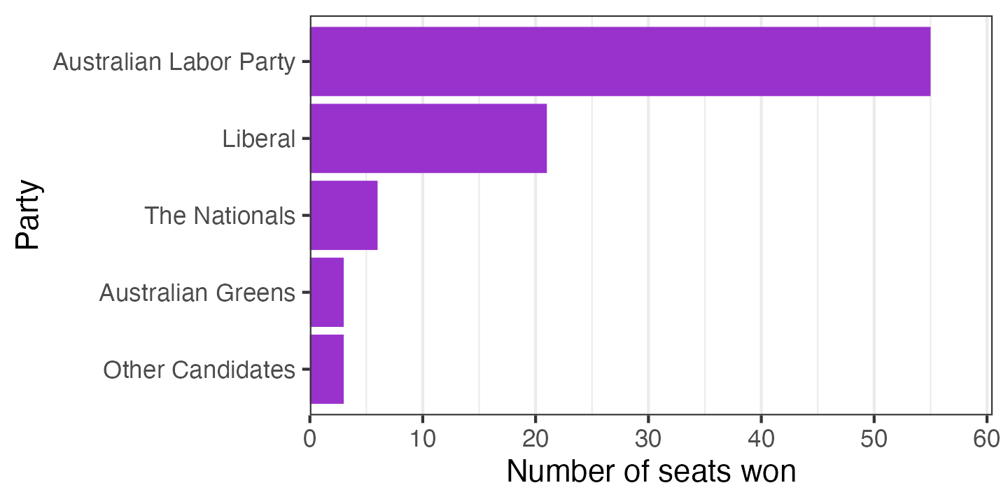
In this context, it would be conventional to colour the bars based on the party being represented. Here I’ve set fill = party, then given a manual scale for the fill based on party colours found on Wikipedia. I also disabled the legend, which isn’t necessary in this instance—the party names are already next to the bars. I’ve also added a title and a caption indicating the source of the data; these wouldn’t normally be included in an academic publication but are a very good idea for a plot which might be copied out of context.
ggplot(election_data_sorted,
       aes(x = seats_won, y = party, fill = party)) +
  geom_col() +
  scale_x_continuous(expand = expansion(mult = c(0, 0.1))) +
  scale_y_discrete(limits = rev) +
  scale_fill_manual(breaks = c("Australian Labor Party", "Liberal", "The Nationals",
                               "Australian Greens", "Other Candidates"),
                    values = c("#DE3533", "#0047AB", "#006644",
                               "#10C25B", "#808080")) +
  labs(x = "Number of seats won",
       y = "Party",
       title = "Victorian election 2018 lower house results",
       caption = "Data source: Victorian Electoral Commission") +
  theme_bw() +
  theme(panel.grid.major.y = element_blank(),
        legend.position = "off")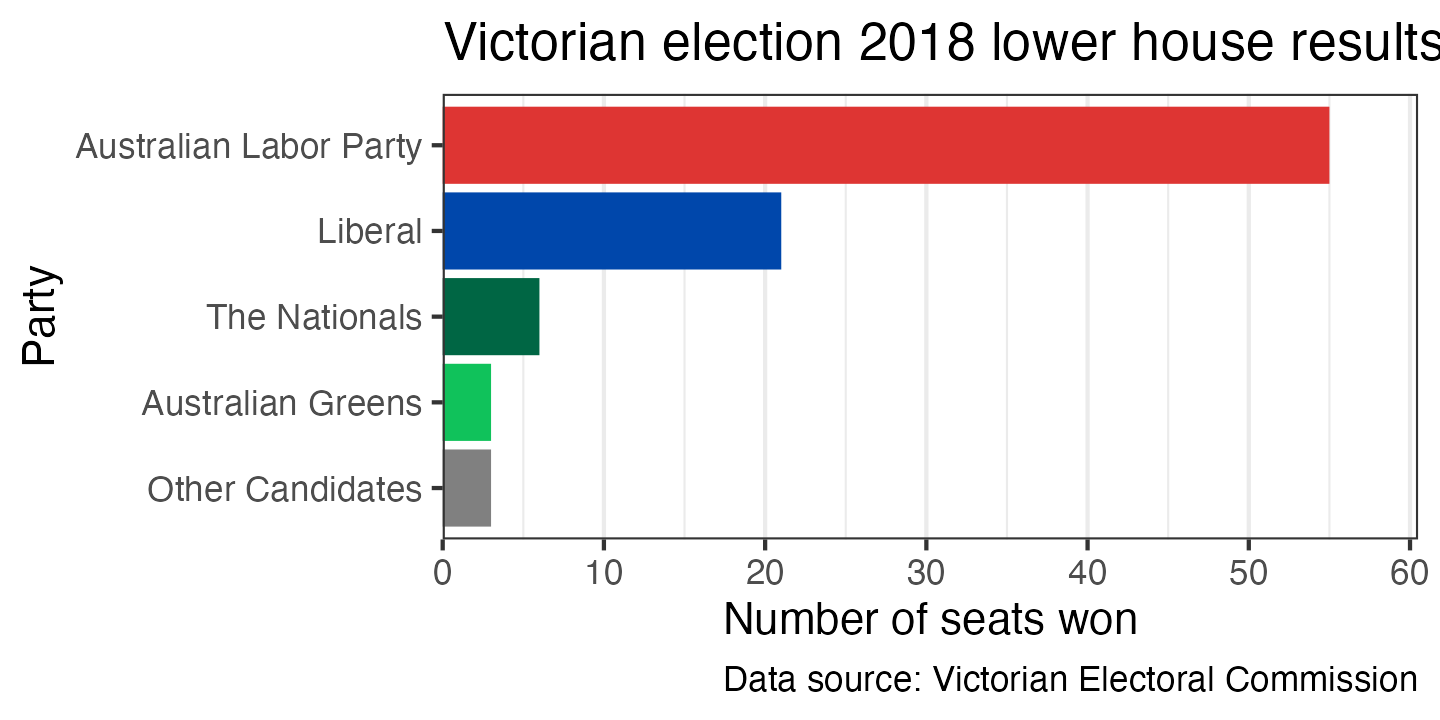
Depending on what you’re trying to show with the graph, you may want to add annotations beyond what is contained in the original data. For example, you could add a dashed line at 44 seats indicating the number required for a party to form a majority government (which could slightly misleading, since the Liberal and National parties govern in coalition). In ggplot, you can pass specific data to any geom_ function; in this example I’m using geom_vline to draw the dashed line and geom_text to draw the label:
ggplot(election_data_sorted,
       aes(x = seats_won, y = party, fill = party)) +
  geom_vline(xintercept = 44, linetype = 2, colour = "grey20") +
  geom_text(x = 45, y = 4, label = "majority of\nparliament",
            hjust = 0, size = 11 * 0.8 / .pt, colour = "grey20") +
  geom_col() +
  scale_x_continuous(expand = expansion(mult = c(0, 0.1))) +
  scale_y_discrete(limits = rev) +
  scale_fill_manual(breaks = c("Australian Labor Party", "Liberal", "The Nationals",
                               "Australian Greens", "Other Candidates"),
                    values = c("#DE3533", "#0047AB", "#006644",
                               "#10C25B", "#808080")) +
  labs(x = "Number of seats won",
       y = "Party",
       title = "Victorian election 2018 lower house results",
       caption = "Data source: Victorian Electoral Commission") +
  theme_bw() +
  theme(panel.grid.major.y = element_blank(),
        legend.position = "off")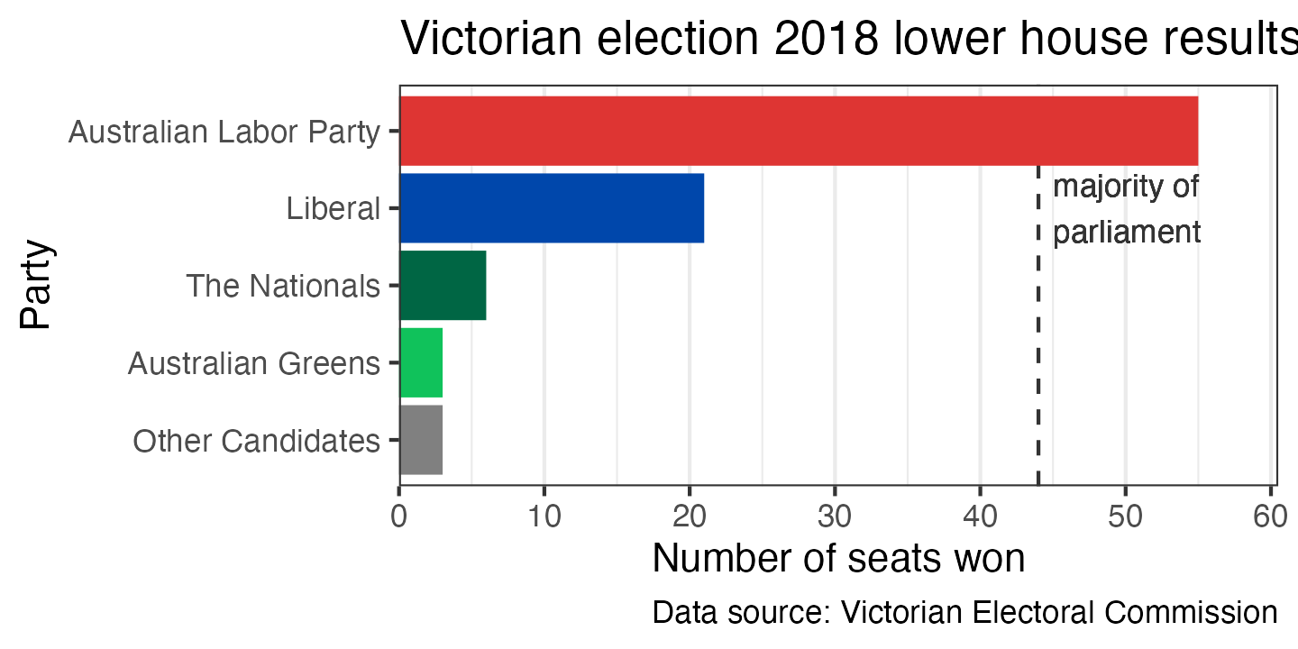
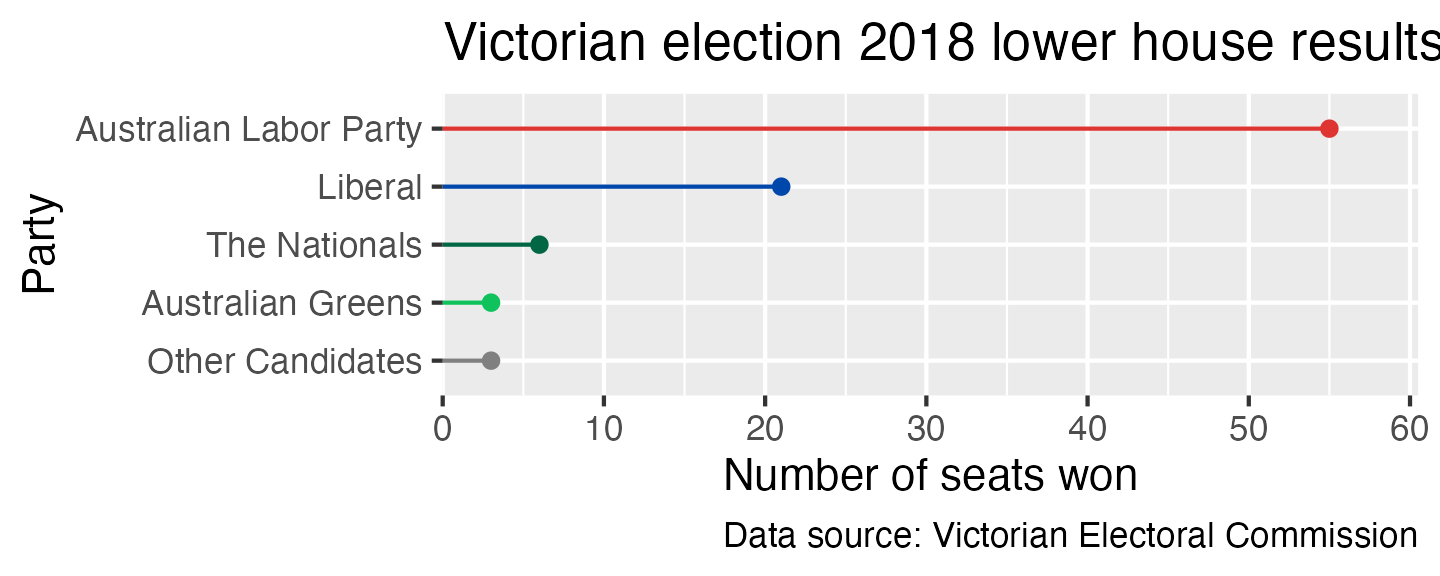
Finally, another good option for representing the same type of data as a bar chart is a line with a point at the end. The point draws the eye to the end of the line, which is the actual value being represented. You can create this in ggplot by using a geom_segment to draw the line segment and geom_point to draw the point. You also need to give xend and yend for geom_segment to work—it’s a general function for drawing line segments, not a specific functon for creating this type of plot.
ggplot(election_data_sorted,
       aes(x = seats_won,
           xend = 0,
           y = party,
           yend = party,
           colour = party)) +
  geom_segment() +
  geom_point() +
  scale_x_continuous(expand = expansion(mult = c(0, 0.1))) +
  scale_y_discrete(limits = rev) +
  scale_colour_manual(breaks = c("Australian Labor Party", "Liberal", "The Nationals",
                                 "Australian Greens", "Other Candidates"),
                      values = c("#DE3533", "#0047AB", "#006644",
                                 "#10C25B", "#808080")) +
  labs(x = "Number of seats won",
       y = "Party",
       title = "Victorian election 2018 lower house results",
       caption = "Data source: Victorian Electoral Commission") +
  theme(legend.position = "off")